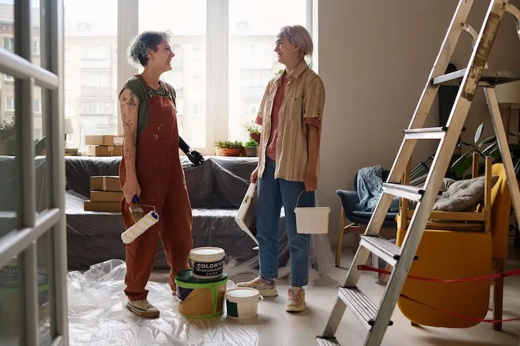
"Uptown Painting." Let me guess—you're picturing a crew in pristine white suits, talking about "undertones" and "accent walls" in a way that makes you feel like you know nothing. It sounds expensive, exclusive, and a little intimidating. The promise of an "artistic transformation" feels like it's reserved for people with interior designers on speed dial.
But here's the real secret, and it's one my friend's uncle, a retired house painter named Frank, taught me: The most artistic transformation doesn't come from the fanciest paint or the trendiest color. It comes from one powerful, counterintuitive principle: Paint the space, not the walls.
Most people pick a color swatch and think, "This will be nice on the wall." Frank thinks, "How will this color change the feel of the entire room at 10 AM versus 8 PM? How will it make the ceiling feel? How will it interact with the light from that window and the color of the oak floor?"
That's the artistic shift. You're not decorating a surface; you're composing light and perception. Let's break down Frank's "Uptown" secrets.
The Foundational Secret: Light is Your Co-Conspirator
Color is not a static thing on a can. It's light reflected. The same exact paint will look different in every single room of your house. The secret is to test not just the color, but the color in the context.
The Professional's Test Method:
- Get sample pots (not just swatches).
- Paint a LARGE (at least 2'x2') square directly on the wall. Not a tiny patch.
- Paint a second square on a piece of primed poster board. Move this around the room throughout the day—into the corner, by the window, in the shadowy spot.
- Observe for 72 hours. See it in morning, noon, afternoon, and artificial light at night. Does it turn muddy? Does it glow? Does it make the room feel cozy or like a hospital?
This process tells you what the paint actually does, not what you hope it does.
The Five "Uptown" Techniques for Transformation
1. The Ceiling is the Fifth Wall (The Most Important One)
The standard white ceiling is a missed opportunity. It's a blank canvas 8 feet above you.
- To make a room feel intimate and cozy: Paint the ceiling a darker color than the walls. Even just a shade or two darker. It visually lowers the ceiling, creating a "hug" of color.
- To make a room feel airy and expansive: Paint the ceiling a lighter, brighter version of the wall color. Not white, but a pale tint in the same family. It makes the walls feel like they're reaching upward.
- The Artistic Move: In a room with beautiful trim, paint the ceiling the same color as the trim. This creates a cohesive "frame" for the room.
2. Trim & Doors: The Frame of the Picture
Don't default to bright white. It can look stark and cheap.
- For a rich, integrated look: Paint trim and doors a slightly darker or lighter shade of the wall color. This is called "tonal" and it's incredibly sophisticated. A cream wall with a rich ivory trim.
- For bold, modern definition: Use a true, clean contrast. Deep navy walls with crisp, pure white trim. But the white must be carefully chosen (see below).
- The Secret of White: There are a thousand whites. For trim, you usually want a white with a hint of gray or black base (like Benjamin Moore's Chantilly Lace or Simply White) to avoid a blinding, blue-ish cast.
3. The "Saturation Gradient" Rule
This prevents rooms from feeling flat or boxy.
- North-facing rooms (cool, gray light): Use warmer, slightly more saturated colors to counteract the chill. Think creamy yellows, warm taupes, soft terracotta.
- South-facing rooms (warm, abundant light): You can use cooler, more subdued colors without them feeling cold. Grays, blues, and greens will look true and clean.
- The Uptown Trick: If you love a color but it's too bold, most paint stores can mix it at 50% or 25% strength. You get the hue without the overwhelming saturation. This is how you get those "is it gray? is it blue? is it green?" magical colors.
4. The "View Through" Composition
Artistic transformation considers sight lines. Stand in your hallway. What rooms do you see?
- Create a flow: The colors of adjacent rooms should have a conversation, not an argument. They don't have to match, but they should be in the same color family or share a common undertone. A sage green living room can flow beautifully into a room with greige (gray-beige) walls because they share earthy, muted undertones.
- The "Pop" in Perspective: Want a bold, colorful dining room? Great. Make sure the view into that room from the calm, neutral living room is framed like a beautiful Uptown Painting.
5. Finish is the Final Brushstroke
The sheen changes everything.
- Walls: Eggshell or Matte. It hides imperfections and feels soft and contemporary.
- Trim, Doors, Cabinets: Satin or Semi-Gloss. It's durable, wipeable, and reflects a tiny bit of light to define the details.
- Ceilings: Flat. Always. It hides every flaw and doesn't reflect light weirdly.
- The Artistic Risk: Using a high-gloss on a single, perfect wall or on interior windowsills. It acts like a mirror or jewel, reflecting light and movement in a dynamic way. Use sparingly.
How to "Uptown" Your Paint Job on a Budget
The artistry isn't in the cost; it's in the execution.
- Prep Like a Pro: 80% of the result is the prep. Fill holes, sand smooth, caulk every crack between trim and wall, and use top-quality painter's tape. This costs time, not money.
- Invest in Three Tools: A high-quality angled brush (2.5"), a medium-pile roller frame and sleeve, and a paint edger for crisp lines. They hold more paint, apply it evenly, and make the job faster and cleaner.
- Buy the Best Paint You Can Afford: This is where you might spend more. Premium paint (Benjamin Moore Regal Select, Sherwin Williams Emerald) has better pigments, goes on smoother, covers in fewer coats, and wears better. It’s cheaper in the long run because you'll use less and it will last longer.
- Do the "Cut-In" First: Use your brush to paint a 2-3 inch band along all ceilings, trim, and corners. Then roll the walls. The wet edges will blend seamlessly.
The One Question to Ask Before You Start
"How do I want to feel in this room?"
- Calm and rested? (Soft greens, muted blues, warm grays)
- Energized and creative? (Deeper blues, rich greens, warm yellows)
- Cozy and intimate? (Dark, saturated colors, tonal walls/trim/ceiling)
- Clean and expansive? (Light, bright neutrals, contrasting white trim)
Let the feeling guide the color, not the other way around. That's the ultimate artistic transformation. You're not just changing a color. You're engineering an atmosphere. That's the secret they don't put on the swatch.
FAQs
Should all the rooms in my house be the same color?
Absolutely not. But they should feel intentional together. A common strategy is a "whole-house palette." Choose 3-5 colors (e.g., a warm white, a light greige, a mid-tone green, a deep blue, a neutral darker charcoal). Use them in varying combinations throughout the house. This creates cohesion without monotony.
What's the biggest mistake amateurs make?
Choosing the color in the store under fluorescent lights. The color must be chosen in the room it will live in. The lighting in a paint store has nothing to do with the light in your hallway or bedroom. This is why the large, moveable sample square is non-negotiable.
How do I choose a white that doesn't look cold or dirty?
Identify your room's fixed elements (flooring, countertops, fireplace stone). What are their undertones? Warm (yellow, red, brown) or cool (blue, gray, black)? Pick a white that shares that undertone. For warm elements, choose a white with a hint of cream or ivory. For cool elements, choose a white with a gray or black base.
Is it worth hiring a professional?
For a standard box room you're confident in, maybe not. For complex spaces with high ceilings, intricate trim, bold color choices, or if you have physical limitations, 100% yes. A pro will do in two days what might take you two weeks, with flawless results. The cost is for their speed, skill, and the guarantee of a beautiful outcome. Get quotes, but view it as investing in the final piece of art, not just a chore.
What about painting kitchen cabinets?
This is a high-skill, high-prep job. If you DIY, you must degrease thoroughly, sand, prime with a bonding primer (like BIN or Stix), and use a hard-wearing paint (like Benjamin Moore Advance or Sherwin Williams Emerald Urethane). The prep is 90% of the work. Consider a sprayer for a factory-like finish. If your cabinets are dated in style, Uptown Painting them is the most transformative "Uptown" move you can make.